KryoFlux Stream Plot
A feature of the Graphical User Interface for KryoFlux is graphical visualisation of the data on the disk, which can be shown either while imaging a disk, when converting an already imaged disk using the virtual drive feature, or after finishing in both cases.
Histogram
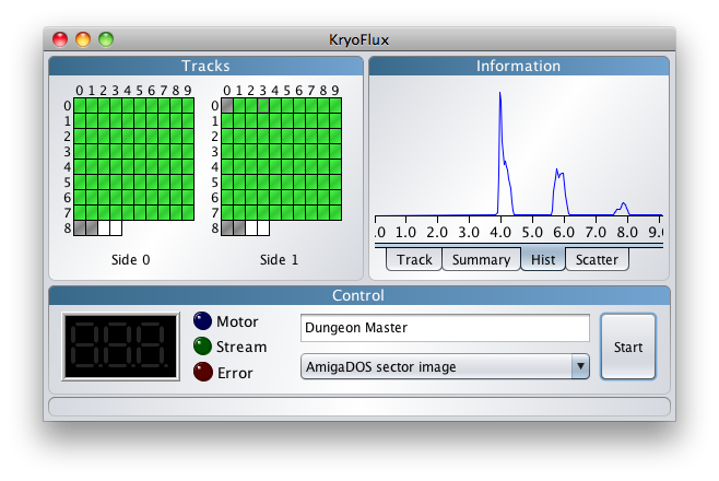
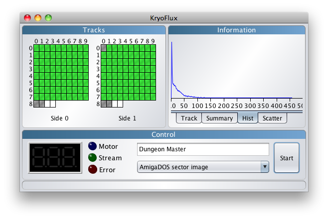
First up, lets look at the histogram visualisation.
On this track, selected by hovering the mouse over (in this case) track 3.1 on the track display, you can see three spikes corresponding to the MFM encoding on the AmigaDOS track. As one might expect for this encoding, you see a greater spike at 4us, then smaller one at 6us and the smallest at 8us, corresponding to the MFM codes of decreasing likely-hood.
What is great about this is that you can get a good idea about what encoding an unknown disk is, which would help narrow down identifying the system it is for.
Scatter
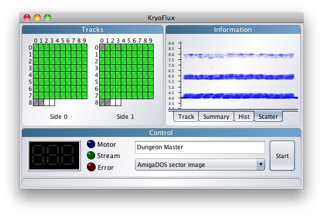
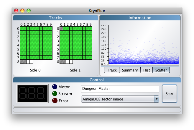
The histogram can give you feedback on the state of your disk, but another useful visualisation is to plot the flux transition times more directly in the form of a scatter chart.
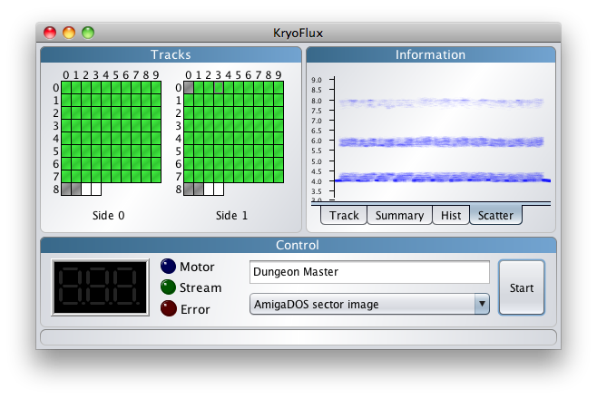
Here you can vaguely make out the 11 blocks, separated by gaps, and also the inter-sector gap each side (we may also show multiple revolutions in the future, where you can more clearly see those). This can be made more visible by adjusting the alpha-transparency by pressing the ‘+’ or ‘-’ keys to increase or decrease it.
Actually, the default is usually good enough, so we artificially decreased the alpha level on the top scatter chart to emphasise the affect.
The scatter chart plots a pretty vast amount of information, and it is difficult to see the meaning behind the data when it is a mass of data points, and this is where the alpha transparency really helps. The darker areas show where there are many datapoints bunched up together on the same screen pixel.
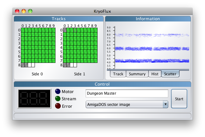
Now, lets focus in on two blocks using the horizontal zoom by using the mouse scroll wheel. When you zoom, you place the mouse in the area you want to focus on when scrolling.
By using the scroll wheel while holding down ALT, you can scroll vertically too. At this level of zoom, the alpha transparency effect is quite apparent, and summarises the data really well.
Unformatted Track
Often you may wonder why you can’t image a disk, and so it is quite interesting to know what an unformatted or completely wiped track looks like.
Bad Tracks
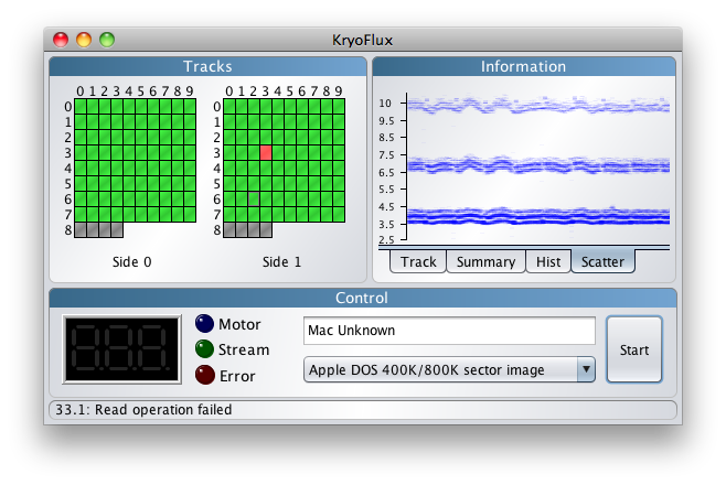
It’s useful to know why a track might be bad. Here is an old Mac disk that seems to have trouble spinning in the drive. The track shown is actually readable with KryoFlux, but the bad track in the track display is similar.
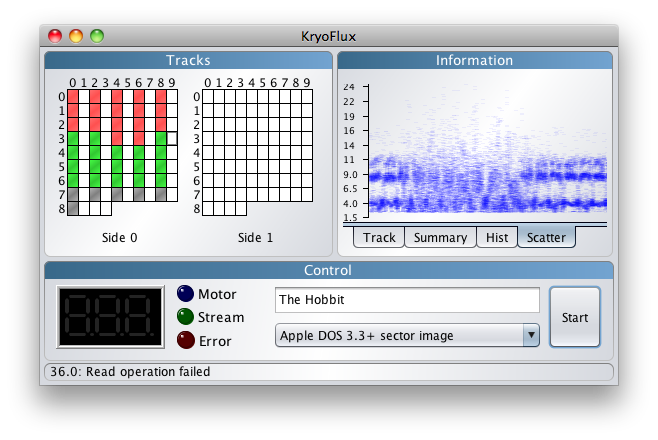
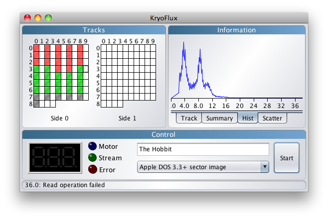
This old Apple 2 disk is a bit messed up, and to illustrate what severe bitrot would look like, we have artificially selected an area in-between tracks on this 40-track disk.
We can also see this from the histogram - instead of nice tight peaks, we get a mess.
Protection Track
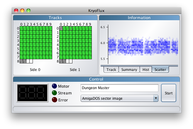
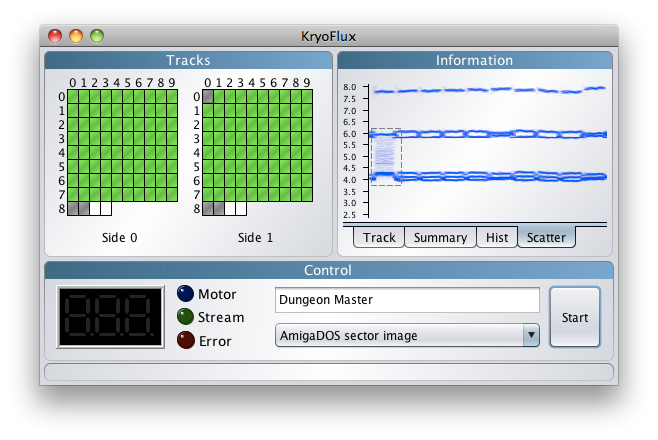
While we’re here, lets look at something even more interesting, the Dungeon Master protection track.
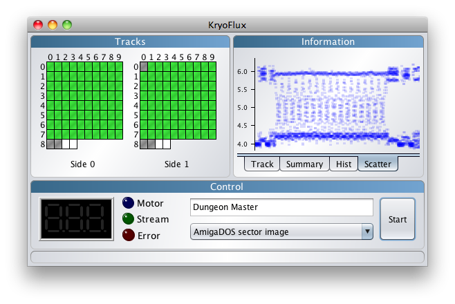
What is that fuzzy area to the left? Well, to see, we drag out an area with the mouse, which is what the dashed line represents. This is a more common way to zoom in on an interesting area.
Interesting, but we can see more, lets use the horizontal zoom again.
It’s pretty awesome that they did that sort of thing when writing floppy disks back in the late 80’s!
Now Available
This feature is in the latest version, and we hope you found this tutorial informative.
![[logo]](/lib/tpl/sps/layout/header-logo.png)
![[motto]](/lib/tpl/sps/layout/header-motto.png)

